Not Very Scalable
I have been teaching some informal lessons to colleagues based on the Python version of Software Design by Example, and one thing that has bothered me is the sizing of the diagrams. It’s not too bad in a chapter like this one, but when those same SVG files are displayed in slides they are a bit hard to read.
I thought the solution would be simple: “SVG” stands for “Scalable Vector Graphics”, so I should just be able to apply a scaling factor via CSS to enlarge the diagrams when they are displayed in slide files. (Modifying the source isn’t an option: they are all carefully sized for the print edition, and I’m not going to duplicate 107 diagrams to solve what is in reality a minor annoyance.)
But what scaling factor should I apply and how should I apply it? I can’t specify an absolute width or a page-relative fraction: the source diagrams have different intrinsic sizes, so either of those options would result in different diagrams being scaled by different amounts. Doing this wouldn’t actually be so bad if they just contained lines, but they all have text as well, and if some of the diagrams are effectively scaled from (for example) 12-point to 15-point while others are scaled from 12-point to 18-point, it really stands out.
What’s worse is that when I scale up the SVG by a fixed amount (e.g., 120%) it overlaps with the text below it. A bit of poking around revealed that the browser lays out the text on the slide using the SVG’s original (intrinsic) size, and then resizes the SVG. It isn’t noticeable if the figure is the last or only thing on the slide, but that’s not always the case.
The best solution so far comes from Cameron DeCoster,
and relies on the fact that all of these SVG images are contained in figure elements:
:root {
     --image-width: 80%;
}
figure.fullwidth img {
    width: 100%;
}

img.centered {
    display: block;
    margin-left: auto;
    margin-right: auto;
}
img.image {
    width: var(--image-width);
}

img.scaled-img {
    /*
    Setting the width to a percentage increases the size of the of
    the image, but the width of the image is calculated using the
    intrinsic size during the initial layout phase and doesn't get
    updated as the image is scaled up.
    (https://developer.mozilla.org/en-US/docs/Glossary/Intrinsic_Size)
    */
    width: 120%;

    /*
    Setting the width to an explicit number provides an
    independent container element and everything works correctly.
    */
    /* width: 500px; */

    /*
    Using a scale transform increases the size of the image but
    doesn't update the page layout.  As such, the image element
    will begin to overlap surrounding elements at higher scales.
    */
    /* transform: scale(1.6); */
}
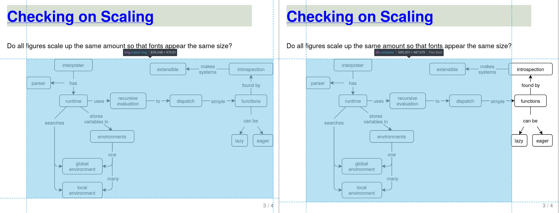
It’s still not perfect: as the image below shows, the rescaled figure is no longer centered. As Cameron explains:
The centering issue is due to the fact that there’s a cyclic dependency between two elements: the image and the container. Using flexbox on the figure with center justified content means that the content of the container (the image) will set the width. However, we’re using a percentage for the width on the image, which depends on the width of the parent (the container). The W3C resolves this as stated here. The result is that the initial width calculation is performed using the original size of the image, then the container is centered, then the image is scaled. Unfortunately, that means that the image centering calculation is done with a different width than the image we see, and things look wonky.
SVG is now 25 years old. I think “scale this up” ought to be a lot easier than it is, but my real gripe is that I have no idea how the average person would ever figure this out. If you want to play around with a small example, please check out this repository.